
Introduction
In this article, you will explore using variable colours in SF Symbols 4. SF Symbols is a compelling package provided by Apple to incorporate beautiful iconography inside your applications, it’s been growing hugely since 2019, and you can read about this in more detail here.
In this article, we’re going to look at variable colours within SF Symbols which were announced in WWDC22 and are available in iOS 16 and Xcode 14.
Before we begin, ensure you have version 4 of the SF Symbols macOS application. You can download it here.
Let’s jump right in!
Incorporate an SF Symbol
Create a brand new SwiftUI application and paste in the code below:
struct ContentView: View {
    var body: some View {
        VStack {
            Image(systemName: "rectangle.and.pencil.and.ellipsis")
                .imageScale(.large)
                .font(.system(size: 60))
        }
    }
}
It’s something you’re probably used to, including an Image with an SF Symbol.
What’s a Variable SF Symbol
Apple introduced a way to move an SF Symbol’s layers progressively. So, for example, let’s take a symbol that you’re incredibly familiar with.

It’s the battery indicator, which you’ll see across many of your hardware, and in most cases, the layer in the middle will change based on the percentage of battery remaining.
For example, if you’re running low on battery, it will look like this.

This is what variable colour allows you to do within SF Symbols, and Apple has provided many of the icons within SF Symbols available. It’s also possible to create your own and define the layers within.
Open the SF Symbols macOS application and navigate to the Variable category.
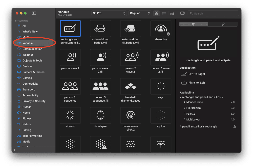
All of these icons are available in variable colours. So let’s go ahead and click on what varying colours are available.

You can adjust the percentage and watch the layer change opacity based on the progress.
Let’s go ahead and implement this in SwiftUI.
Implement Variable Colour in SwiftUI
Let’s continue with our basic SwiftUI application and implement the variable colours.
struct ContentView: View {

    @State var value = 0.0
    let timer = Timer.publish(every: 0.5, on: .main, in: .common).autoconnect()

    var body: some View {
        VStack {
            Image(systemName: "rectangle.and.pencil.and.ellipsis", variableValue: value)
                .imageScale(.large)
                .font(.system(size: 60))
            Image(systemName: "wifi", variableValue: value)
                .imageScale(.large)
                .font(.system(size: 60))
            Image(systemName: "phone.down.waves.left.and.right", variableValue: value)
                .imageScale(.large)
                .font(.system(size: 60))
            Image(systemName: "shower.fill", variableValue: value)
                .imageScale(.large)
                .font(.system(size: 60))
        }
        .onReceive(timer) { _ in
            if value < 1.0 {
                value += 0.25
            } else {
                value = 0.0
            }
        }
    }
}
In this example, we have some boilerplate code that will change the value based on a Timer running every 0.5s. This is so that we can see the animation of the variable colour.
Build and run the project.

That’s it; you have implemented the variable colour.
To recap, Apple introduced variableValue to the Image API, which allows us to set the value of the variable colour.
Image(systemName: "wifi", variableValue: value)What Next?
You can read more or recap SF Symbols in my previous article here. Why not try and build your icon and make it variable? Do you accept the challenge? Let me know how you get on with that.

