
This article was written using Xcode 14 and iOS 16 Beta 1
Introduction
Apple announced a brand new framework called Swift Charts during the WWDC 22. In this article, we’re going to explore this brand new framework.
Define the Data Source
Before you start building a beautiful looking chart using the Swift Charts framework, you first have to decide what the data source is going to look like. In your example, you’re going to display a chart that represents our SwiftlyRush Bank spend amount per month.
struct Amount: Identifiable {
    var month: String
    var amount: Double
    var id = UUID()
}
You can consider this basic data structure which contains the month and amount of the spend through our digital bank.
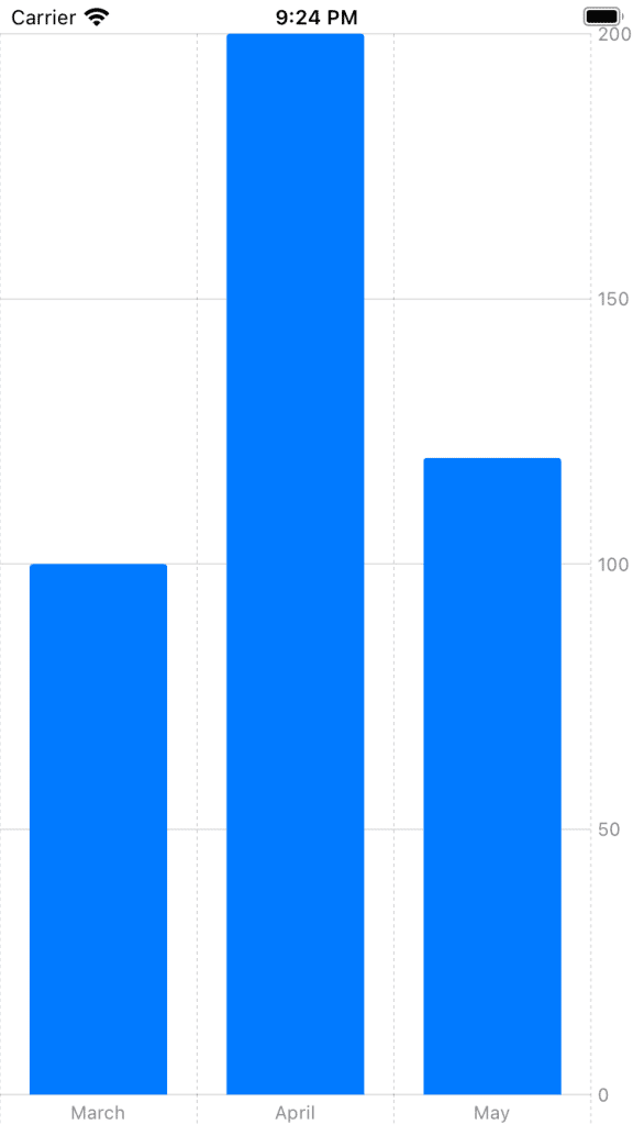
var data: [Amount] = [
    .init(month: "March", amount: 100.00),
    .init(month: "April", amount: 200.00),
    .init(month: "May", amount: 120.00)
]
You can go ahead and create a data object which instantiates our data through a tuple, of course, this is a basic example and you might pull this data from a server or similar.
Create the Chart View
You now have the data and the structure, you can go ahead and create a basic bar chart.
import SwiftUI
import Charts

struct BarChart: View {

    var data: [Amount] = [
        .init(month: "March", amount: 100.00),
        .init(month: "April", amount: 200.00),
        .init(month: "May", amount: 120.00)
    ]

    var body: some View {
        Chart (content: {
            BarMark(
                x: .value("Month", data[0].month),
                y: .value("Total", data[0].amount)
            )
            BarMark(
                 x: .value("Month", data[1].month),
                 y: .value("Total", data[1].amount)
            )
            BarMark(
                 x: .value("Month", data[2].month),
                 y: .value("Total", data[2].amount)
            )
        })
    }
}
Here you are creating the individual BarMark’s separately but we could also iterate over this automatically.
struct BarChart: View {

    var data: [Amount] = [
        .init(month: "March", amount: 100.00),
        .init(month: "April", amount: 200.00),
        .init(month: "May", amount: 120.00)
    ]

    var body: some View {
        Chart {
            ForEach(data) { item in
                BarMark(
                    x: .value("Month", item.month),
                    y: .value("Total", item.amount)
                )
            }
        }
    }
}
The result is quite remarkable.
You can also use the same data source to define various different chart types.
    var body: some View {
        Chart {
            ForEach(data) { item in
                PointMark(
                    x: .value("Month", item.month),
                    y: .value("Amount", item.amount)
                )
            }
        }
    }
As you can see, you’re now plotting this data instead.

Customizing your Chart
You’re probably wondering if you can change the colour or the Swift Charts and the answer is yes and quite easy too.
struct Amount: Identifiable {
    var month: String
    var amount: Double
    var id = UUID()
    var color: String
}
You have inserted a brand new String item to your data source named “color”.
var data: [Amount] = [
    .init(month: "March", amount: 100.00, color: "red"),
    .init(month: "April", amount: 200.00, color: "green"),
    .init(month: "May", amount: 120.00, color: "yellow")
]
You can go ahead and insert those color choices within your data object.
struct BarChart: View {

    var data: [Amount] = [
        .init(month: "March", amount: 100.00, color: "red"),
        .init(month: "April", amount: 200.00, color: "green"),
        .init(month: "May", amount: 120.00, color: "yellow")
    ]

    var body: some View {
        Chart {
            ForEach(data) { item in
                BarMark(
                    x: .value("Month", item.month),
                    y: .value("Total", item.amount)
                )
                .foregroundStyle(by: .value("Month Color", item.color))
            }
        }
    }
}
You can insert a foregroundStyle modifier with the value of the colour, and watch the result.

Expand the Data Source
Let’s go ahead and expand our data source to contain more data points.
    enum Month: String, CaseIterable {
        case January
        case Febuary
        case March
        case April
        case May
        case June
    }

    private func randomMonth() -> String {
        return Month.allCases.randomElement()?.rawValue ?? ""
    }

    private func generateData() -> [Amount] {
        var array: [Amount] = []
        for _ in 0...50 {
            array.append(Amount(month: randomMonth(), amount: Double.random(in: 1...1000)))
        }
        return array
    }
Let’s go ahead and insert the above boilerplate code that will create some dummy data for us to use on the Swift Charts. You’re creating an enum that will contain our Months of the year.
You’re then creating a function which will return a String of a random Month case.
Finally, you’re generating an array of 50 items that will be plotted on the chart.
var body: some View {
    Chart {
        ForEach(generateData()) { item in
            PointMark(
                x: .value("Month", item.month),
                y: .value("Amount", item.amount)
            )
        }
    }
}
The final piece is to insert the generateData() function inside our data ForEach loop.
Build & Run the project.

You can also go a step further and remove the ForEach and pass the data directly to the Chart.
var body: some View {
    Chart(generateData()) { item in
        BarMark(
            x: .value("Month", item.month),
            y: .value("Amount", item.amount)
        )
    }
}
What Next?
This article is a living document and will be continuously updated throughout the week. You can read more about Swift Charts here.
You can read more about all the WWDC changes right here.

